


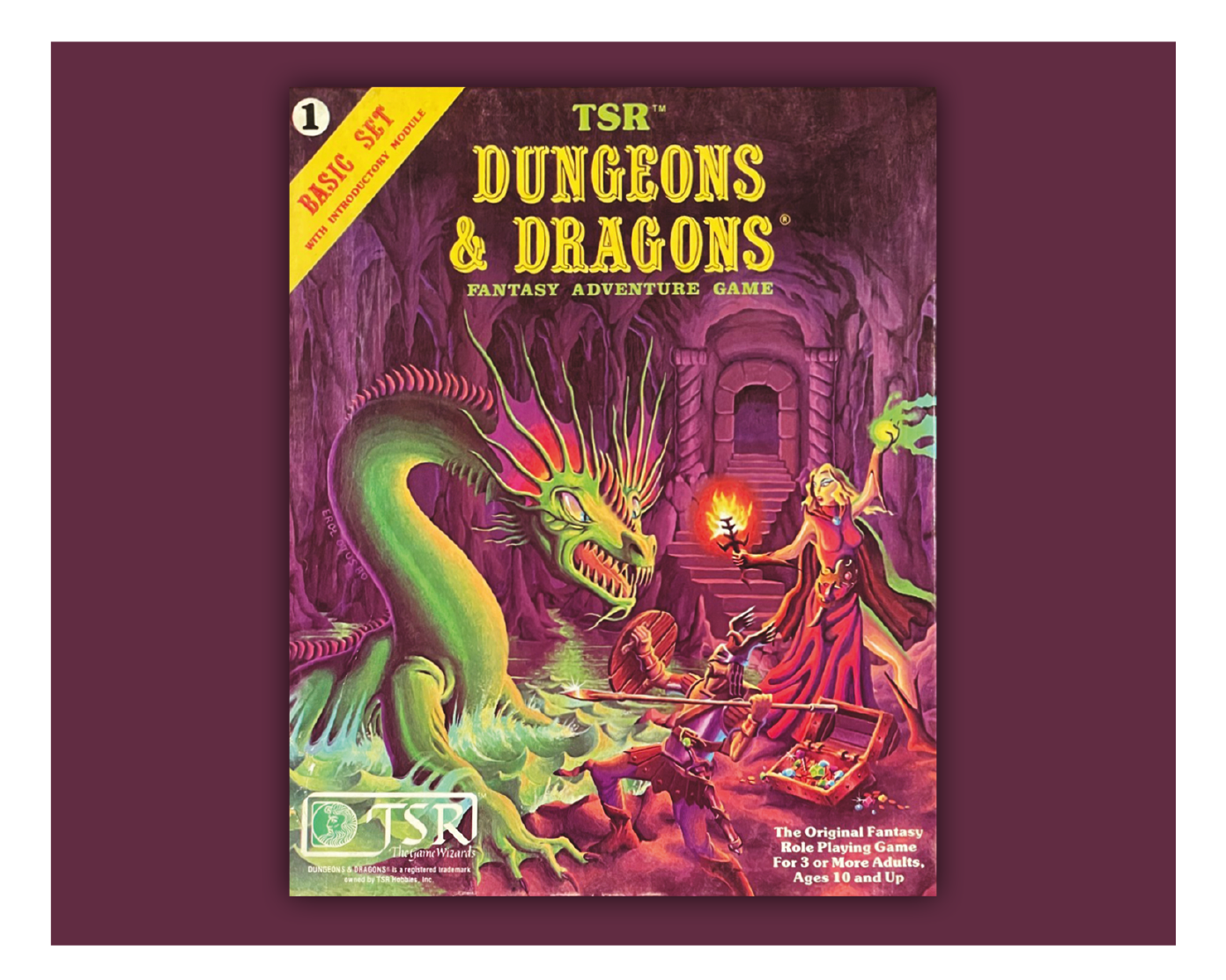
The cover art of the 1981 Dungeons & Dragons Basic Set box is a lurid green-red-yellow painting set deep underground. A sorceress and a warrior are battling a giant lake monster. Jewels spill out of a chest by their feet. This is the original fantasy role-playing game for three or more adults, ages 10 and up.
At age 8 – in sight of adulthood, according to the box! – I’d never heard of D&D. I didn’t know Erol Otus, the cover artist for the 1981 Basic Set box, or Dave Sutherland, whose 1970s designs he was homaging. I do remember sensing the painting had been created by someone, that here was the result of a transfer process between imagination and brush. The underground cavern felt alive in some way, not flat like the Biro sketches of Batman I would try on lined graph paper. I didn’t know how, but that box cover was a doorway inviting me somewhere.
I did know that school sucked. I was a gangly oily stuttery kid at Papatoetoe Central School in South Auckland, New Zealand. Talked too much, thought too much, got the wrong end of every stick. Could barely take two steps for all the awkwardness sloshing round inside me.
Mr. Gilbert, a teacher with a small mustache who kicked me out of class daily, was carrying the box in a plastic shopping bag just as lunch break finished. He found me, skirted across the playground, handed it over. Here’s something, boy. No need to bring it back. Just have a go and don’t be so bloody annoying in history period next time.
Gruffness and kindness. And a gift. Open this lurid cardboard box. Here lies adventure.
The 1981 D&D Basic Set cover makes a simple, clear promise: We’re going to descend into twisty mysterious caverns, fight monsters with weapons and magic, and find treasure.
Its aesthetics and execution matter. Earlier D&D art sometimes felt flat and two-dimensional, echoing the original photostat sheets that had circulated among hobbyist groups in Wisconsin in the 1970s. The ’81 Basic Set is richer, fuller, translated into a dynamic three-quarter scene. The saturated greens and yellows carry a Vistavision/Eastmancolor feel of widescreen possibility.
The most iconic D&D cover ever is probably Larry Elmore’s 1983 image of a red dragon swiping at a fighter. But that ’81 box launched a million imaginations including mine.
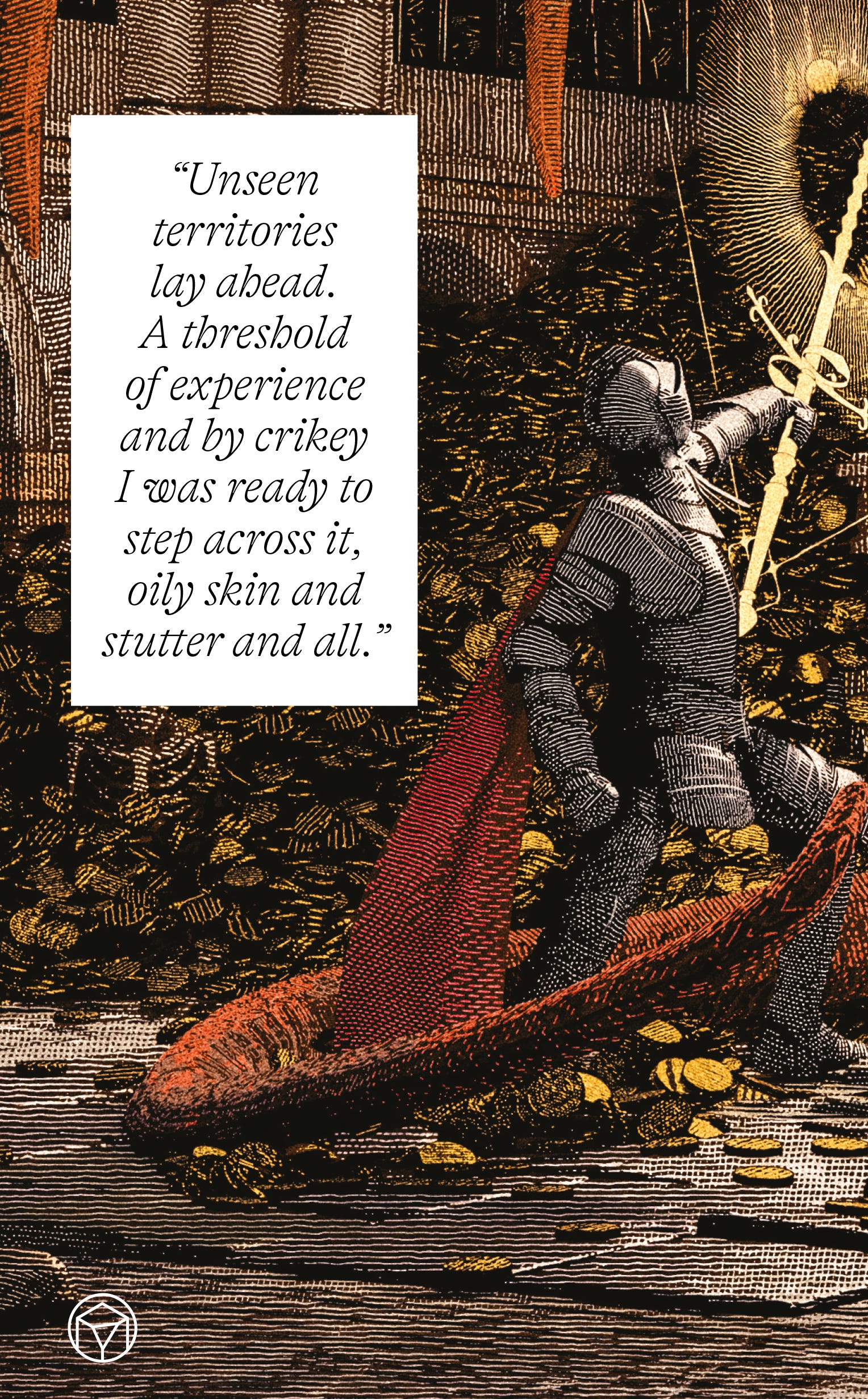
Holding it in the middle of a dull gray primary school, knowing nothing about rules or mechanics or dice, I felt the challenge. Are you up for this, kid? Unseen territories lay ahead. A threshold of experience and by crikey I was ready to step across it, oily skin and stutter and all.
It’s more than a product when it speaks to us. Doorways matter. They originate.

I remember the old paperback book covers in the winding corridors of the Hard to Find (But Worth the Effort) Secondhand Bookshop, a sprawling wooden house in the Auckland suburb of Onehunga that my mum and I would visit several times a year. We’d always get lost driving there and end up huddled over a map tracing the Biro-pen reminders from the last trip. Straight left after turnoff. Fish’n’chip shop too far.
Eventually we’d reach the row of little high street shops, past an ophthalmologist and a kebab takeaway, then the cedarwood door and jumbled window with peeling art nouveau signage and we’d duck inside, and it would begin.
The Hard to Find Bookshop laughed at the Dewey system, instead using geography as its organizing principle. Major subjects by room, offshoots via gantries and ladders and nooks and crawl spaces that would never pass a building inspection but lit the imagination. A territory full of secrets to be explored. There was a tiny staff kitchen with a burned-out teapot and cartons of milk and marmalade that you weren’t supposed to trespass, but I always did. The milk tasted like dusty endpapers and the marmalade had bits in it.
Upstairs on the first floor, past the trail of National Geographics and dictionaries stacked on each carpeted stair was the Science Fiction and Fantasy room. It had a never-cleaned window looking out onto the backyard of the house, where a washing line usually hung with T-shirts and oversize underwear. Things you could see but never quite figure out how to reach.
The old genre paperbacks lining the shelves had style. Each sci-fi fantasy publisher in the golden years – Ace, Ballantine, DAW, Penguin – was competing for attention on crowded bookracks in newsagents, every cover and spine fighting for your 25c with barbarians, maidens, spaceships, alien planets. Strong deep blues. Sharp acid oranges. Geometric shapes and chunky fonts that ran from psychedelic to weirdly formal, anything to make your eye stop. Those original bookracks were a brutal arena.
In the gentler atmosphere of the Hard to Find they felt like fading souls in a retirement home. Comfy on their shelves but still craving your attention. Wanting a chat.
I had a Mum budget every time. Either $15 or a set number of books. You can imagine the negotiations and trade-offs. Is a thin Isaac Asimov paired with Larry Niven worth more than a hardback Harlan Ellison?
The buying process was secondary, though. Perhaps even the reading was. To this day I’ve never opened Brian Aldiss’s Helliconia, or Frankenstein Unbound, or the short stories of Cordwainer Smith, or Michael Moorcock’s The Dancers at the End of Time. The sunburst covers sitting on a plywood shelf promised me more than the actual text might ever deliver.
I was 8. I knew what I liked. I knew what I could sense but not see. There’s always more in the Hard to Find, somewhere, just out of sight.
What are the first principles of how these covers connect so instinctively? Of how we sense lifetimes and labyrinths in a piece of commercial art?
The most obvious to me is boldness. Not necessarily childish, but with the same clarity that we remember from being 4 years old and seeing a blue-red birdhouse in the morning sunlight for the first time.
The second is they often imply geography. A place our souls can visit, if we dare. Like flaneurs in an unreal city, a realm where flavor and taste and feeling and light and mood and memory and action and THINGS are all somehow the same thing. There should be a simpler and more spatial word than synesthesia.
They’re an incomplete promise we return to. Not to read every book or play every Dungeons & Dragons module but to pause just a moment in that suspended possibility of what if we could.
And they’re more real than reality often feels. Andrej Karpathy, Tesla’s former AI lead, said recently that we’re not recreating people with large language models, we’re making ghosts. Well to me it feels like the ghosts are us, and all around already. Perhaps only VistaVision monsters and starships can reconnect these fragmented promises of ourselves.
School still felt all too real, and its emotional geography still sucked. Later that year I got a new pair of shoes, blue-striped Bata Bullets that we found in Dress for Less on discount. They felt special for a day and a half until three kids stole one of them and dumped it in the trench of the boys’ toilets by Block 4, pissing on it and laughing and rubbing one of those evil-smelling urinal cakes all over.
Not only is a pissy shoe aesthetically ugly, it’s a trap: Do you clean it up and wear it and be the pissy shoe boy for a term, or does your mum buy you another new set and you’re the fancy bastard?
A promise opened and closed, then. The hopeful line of thought is that pain and humiliation have value in their own right, the sculptor’s chisel blows that help shape us, as C.S. Lewis once said. But I’m simple enough that I’ll still take a Dungeons & Dragons set and a hungry dinosaur over a dribbly urinal cake.
Now I’m here in Tokyo, a place I keep returning to and love. Sitting at a table outside Tsutaya Books in Daikanyama, working away.
Tsutaya Books is beautifully constructed, three interconnected pavil - ions wrapped in a white lattice screen of T-shaped ceramic sticks. The flow connects you to zelkova trees outside, while the interior feels like a private library rather than a retail space. Oak veneer, low lighting, books and art and objects chosen by hand, arranged by taste.
Tsutaya Books is a long way from South Auckland or the Onehunga high street with the kebab takeaway. But it’s a place that loves books and promises adventure, still.
Sitting at this outdoor table under autumn trees. A dog-grooming place nearby that’s wonderfully preposterous. I hurt my knee when I first arrived in Tokyo on this trip but it’s feeling better now, itching under the table in its compression sleeve.
The work right now is making a video game, something my team has been building towards for a while through several false starts. Fittingly it’s about an old bookshop – how things come full circle! – and the art research has involved looking at thousands of old and new paperback covers. When you again dive deep into those painted doors of the imagination you see the love infused into the classic pulp style, those handpainted Ace, Ballantine, DAW, Penguin-type bookrack survivors, with planets and maidens and castles and so many other invitations. In structured testing we’ve consis - tently found that players respond far more strongly to these than modern designs. The pulps communicate in archetypes that reach into your chest and your childhood.
So, happily for us, we’re running with the good stuff as our style.
Making games is exciting and frustrating and hard, late-night Discord messages and video calls and constantly working on the next build. But I’m optimistic we’ll find our way through this one. And there’ll definitely be a box with a warrior and sorceress and a jewel chest tucked away somewhere on a virtual shelf.
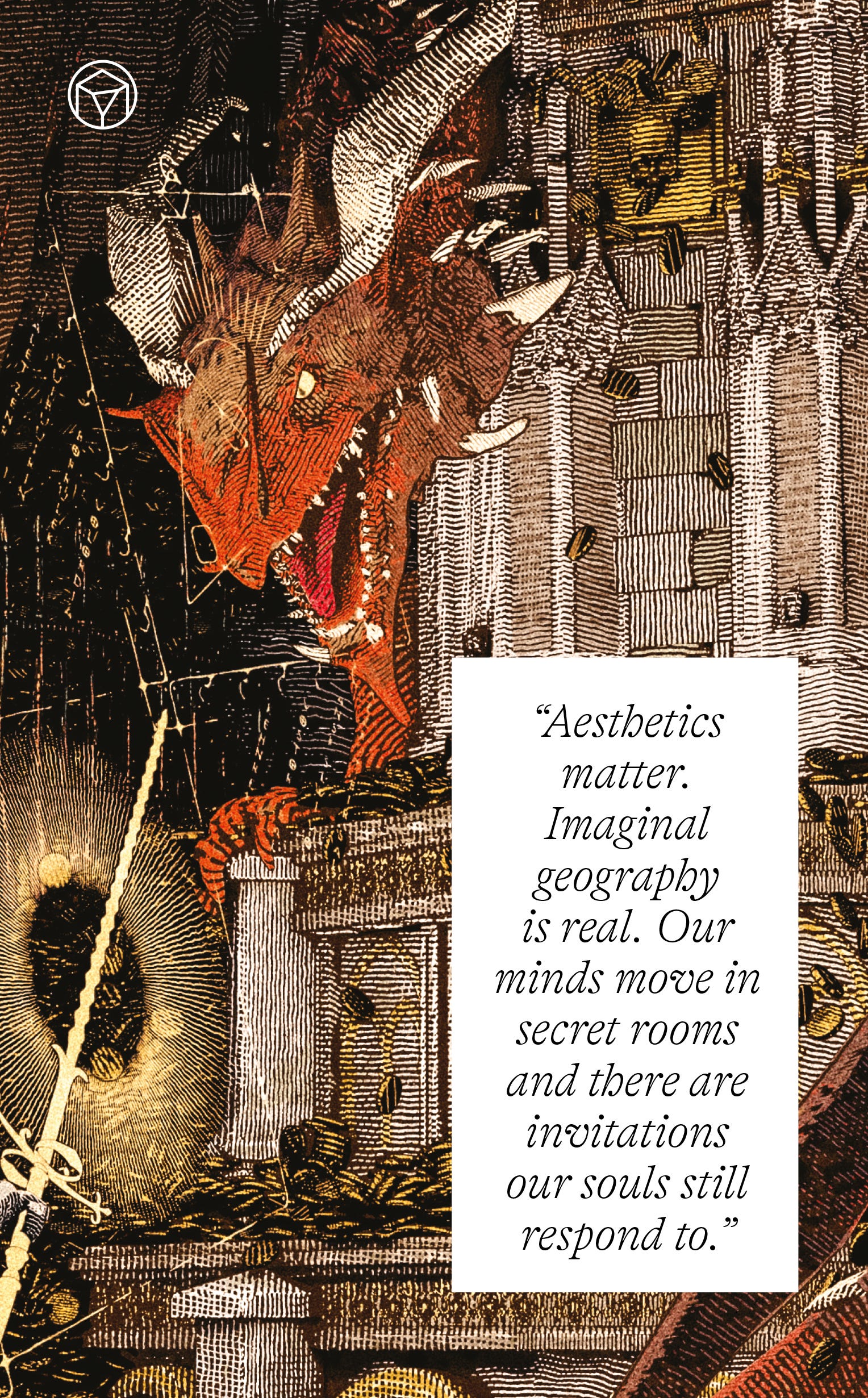
Aesthetics matter. Imaginal geography is real. Our minds move in secret rooms and there are invitations our souls still respond to. First forays shift from response and consumption to creating things for others, at which point we become promise makers and continue an ancient evolutionary dance.
The beauty in these things is nutritious and real. It can save the world, and us, if we take up the challenge, open the door, and play.

